


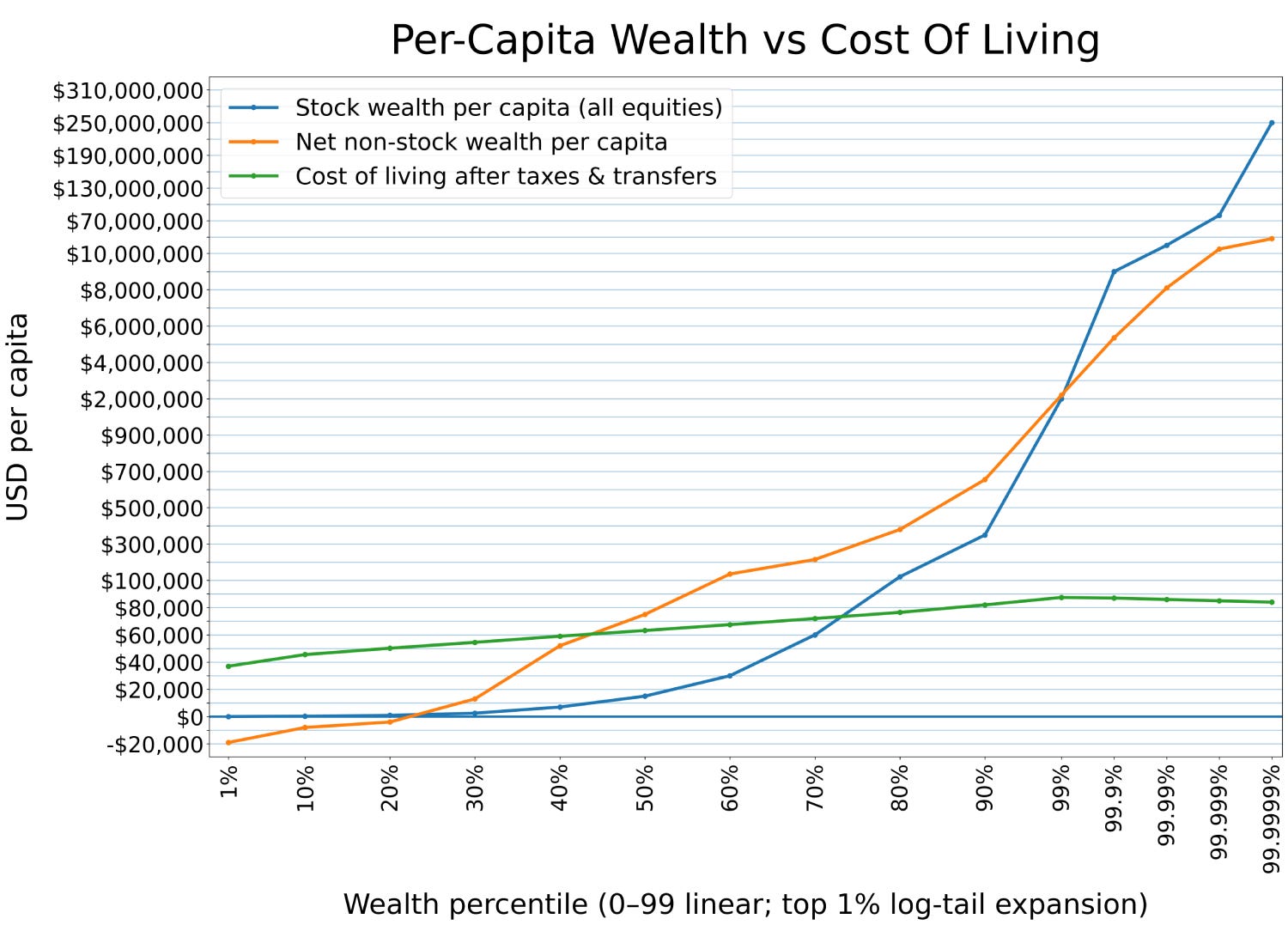
At a casual glance, the chart above probably looks like an ordinary graph of wealth inequality in the United States. It captures all kinds of crucial trends that define economic life in this country — for example, that the bottom quintile has negative wealth (they’re in debt), and that 45% of the country are making less than the national cost of living.
