Matt Yglesias is still lying about Democratic donors
Another swing at the Shor / Yglesias "rich people have made Democrats too progressive" schtick.
Over the past year or so, a handful of Democratic pundits like David Shor and Matt Yglesias have been workshopping a clever line of attack on left-wing politics: that it is the rich, rather than the working class majority, that have been pulling Democratic politics to the left. Here for example is Yglesias:
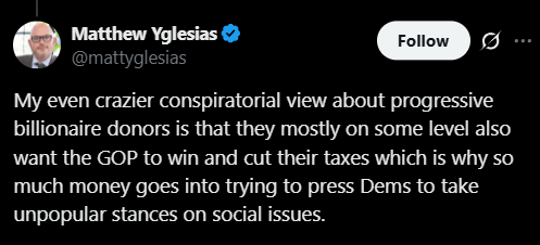
The upshot of course is that for Democrats to win they need to move right, supposedly where working class votes are waiting for them, instead of pandering to their billionaire donors. This line also has the advantage of hoisting class-war focused leftists by their own petards (turns out they are the ones on the side of the rich!) which probably explains Yglesias’s investment in it as much as anything. Again, here he is just over the weekend:
This time he leaves out “billionaire,” but the implication is clear: left-wing intellectuals are worried about the reactionary influence of rich donors, not of small-dollar donors, and Matt is suggesting that they are confused. As evidence, he provides a chart from this Yale paper (slightly edited for clarity):
But do you see what he did here? This chart does not show the policy preferences of billionaire donors anywhere. It shows the preferences of all donors, but of course if you average the preferences of 1000 $27 donors and one $1,000,000 donor, the result is going to overwhelmingly reflect the small dollar donors, not the single rich guy. If anything, the preferences of the affluent are a much stronger indicator of affluent donor preferences — and they predict policy preferences that are relatively conservative.
It would be easy to dismiss this as an innocent misread of the data, but it’s a very similar category error to the one that David Shor was dealing in less than a year ago. A less generous reading of this ongoing narrative is that pundits like Shor and Yglesias know perfectly well that they are playing fast-and-loose with the data, but that they simply find the talking point to appealing to let facts stand in the way. Perhaps it’s more generous to say that both of them have simply based a major premise of their political analysis around a comically elementary misunderstanding of charts like the one above; either conclusion, in any case, seems pretty embarrassing.
Refer enough friends to this site and you can read paywalled content for free!
And if you liked this post, why not share it?