

Revisualizing taxes
What if tax graphs focused on reducing inequality?

There’s been a lot of discourse about taxes over the past week, mostly kicked off by proposals by Sens. Van Hollen and Booker to cut taxes, followed up by other proposals like Gov. Hochul’s proposal to get rid of taxes on tips. Or at least that’s how they’re pitching it, though Matt Bruenig notes that Booker’s plan, at least, gives the most benefits to the richest Americans. In any case, a lot of folks on the liberal-left aren’t happy about it. The most common objection has just been a general insistance that taxes are good, actually and that Democrats are playing into right-wing ideas about them being intrinsically evil. Eric Levitz, however, has been voicing a more specific complaint: that Democrats are capitulating to a sinister idea called “99 percentism: The belief that only the top 1 percent, or even the small coterie of billionaires within it, should be expected to finance government benefits.”
Setting aside the merits of these particular bills I want to push back on Levitz here, but first I’d like to reframe this argument, starting with a simple claim: economic inequality is the fundamental crisis facing the modern liberal-left. If you are a socialist you will recognize this as a foundational problem of capitalism, but even if you are a liberal you should be able to notice the existential threat economic inequality poses to democracy. And this has enormous consequences across the board, because literally every challenge facing America today that could conceivably be resolved through democratic action is being fortified against remedy by vast concentrations of wealth.
What Levitz calls “99 percentism” has never just been about raising revenue. Taxing the rich (or expropriating from them, if you like) is a good in and of itself because we can use tax policy as a tool to level inequality. That said, since objections to 99 percentism lean so heavily on insisting that you can’t raise enough revenue by taxing the rich, I want to put this argument in perspective.
Read enough about the tax burden in the US and you’ll inevitably come a few standard charts; this article by the Tax Foundation has the major ones. What almost all of them have in common is that they do a terrible job of visually conveying economic inequality. Consider this one, for example:
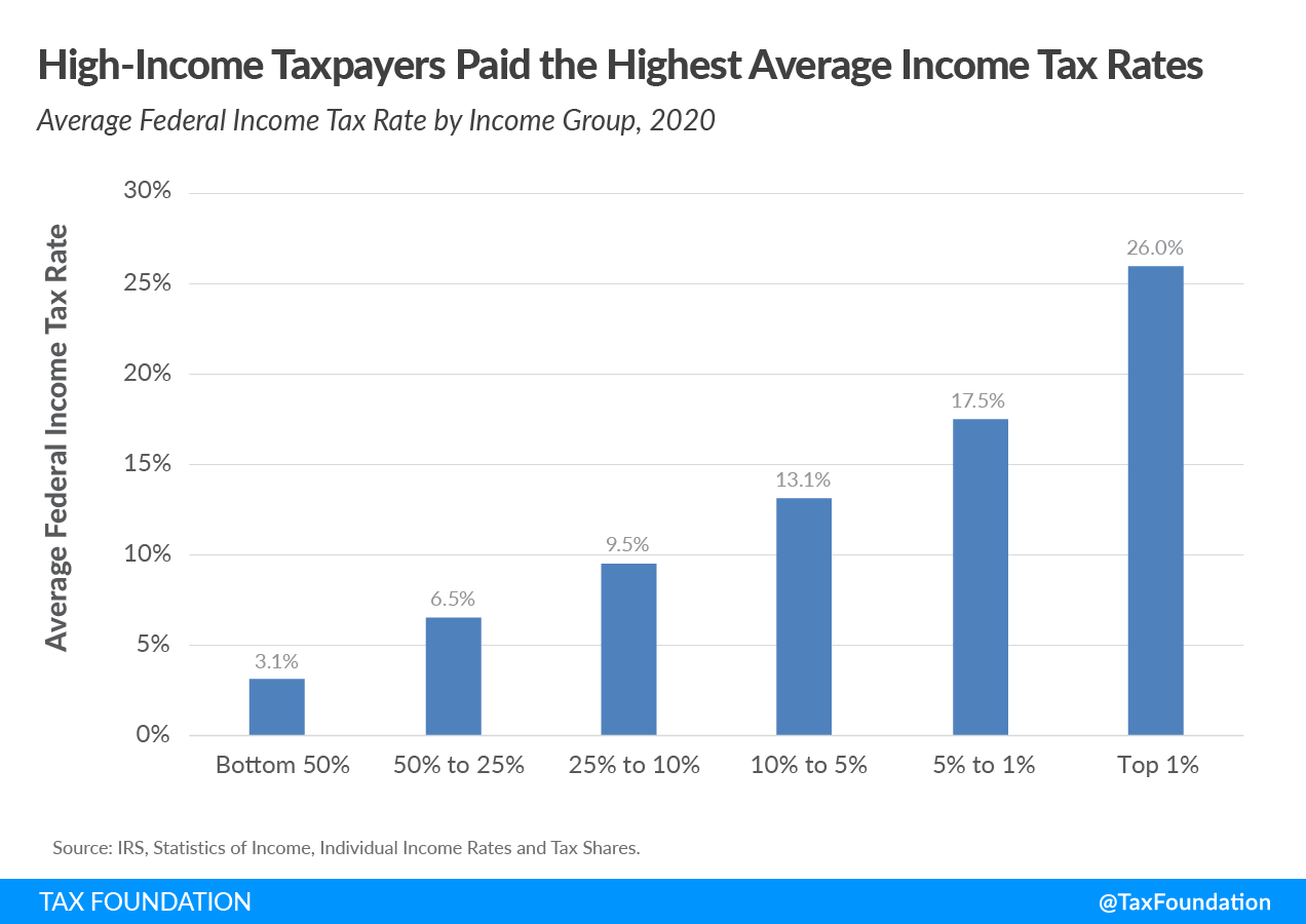
If all you saw were the bars and the Y axis you’d think that this is an apples-to-apples comparison of like groups, with some unfairly forced to pay higher tax rates than the others. The only thing that signals otherwise is textual: the labels indicating that the group on the far left is 50x bigger than the group on the far right. And of course, this chart does absolutely nothing to convey the absolute wealth of each group. That’s how almost all these charts work: they avoid visually representing economic inequality either by omitting crucial information or by including it textually.
With that in mind, I asked: how can we visually relate economic inequality to potential revenue? And here’s what I came up with:
